Examples to learn Matplotlib and Seaborn for Data Visualization.
%matplotlib inline
import numpy as np
x = np.random.rand(50)
x.sort()
print(x)
 y = x**2
print(y)

plt.show()

plt.show()

plt.show()

plt.show()

plt.xlabel('Number')
plt.ylabel('Square')
plt.title('y = x**2')
plt.plot(x,y,'r,')
plt.subplot(1,2,2)
plt.plot(y,x,'b,')

a = fig.add_axes([0,0,1,1])
a.plot(x,y,'r.')
a.set_xlabel('X Label')
a.set_ylabel('Y Label')
a.set_title('Title')

axes1 = fig.add_axes([0,0,1,1])
axes2 = fig.add_axes([0.1,0.6,0.4,0.3])
axes1.plot(x,y)
axes1.set_title('Larger Plot')
axes2.plot(x,y**2)
axes2.set_title('Smaller Plot')

axes[0].plot(x,y)
axes[0].set_title('Title 1')
axes[1].plot(y,x)
axes[1].set_title('Title 2')
plt.tight_layout()

ax = fig.add_axes([0,0,1,1])
ax.plot(x,y)

ax[0].plot(x,y)
ax[1].plot(x,y**2)
plt.tight_layout()


ax = fig.add_axes([0,0,1,1])
ax.plot(x, y, 'r--',label="x=y")
ax.plot(x, y**2, 'g-.', label="x=y**2")
ax.legend(loc=(0.02,0.85))
ax = fig.add_axes([0,0,1,1])
ax.plot(x,y,color="purple", linewidth=3, alpha=0.5, linestyle='steps', marker="s", markersize=20, markerfacecolor="yellow", markeredgewidth=3, markeredgecolor="green")
ax.set_xlim([0.3,0.7])
ax.set_ylim([0.3,0.7])


tips.head()


sns.distplot(tips['total_bill'], kde=False, bins=30)


dataset = np.random.randn(1000)
sns.rugplot(dataset)

x_max = dataset.max() + 2
x_axis = np.linspace(x_min,x_max,100)
bandwidth = ((4*dataset.std()**5)/(3*len(dataset)))**.2
kernel_list = []
for datapoint in dataset:
kernel = stats.norm(datapoint, bandwidth).pdf(x_axis)
kernel_list.append(kernel)
kernel = kernel/kernel.max()
kernel = kernel*0.4
plt.plot(x_axis, kernel, color="grey", alpha=0.5)
plt.ylim(0,1)

fig = plt.plot(x_axis, sum_of_kde, color="indianred")
sns.rugplot(dataset, c="indianred")
plt.yticks([])
plt.suptitle("Sum of the Basis Functions")


sns.swarmplot(x='day', y='total_bill', data=tips, color='black')


tc

fp


Install Numpy, Matplotlib, and Seaborn with the following commands on Terminal/Command Prompt
- pip install numpy OR conda install numpy
- pip install matplotlib OR conda install matplotlib
- pip install seaborn OR conda install seaborn
Run the following in Jupyter Notebook
import matplotlib.pyplot as plt%matplotlib inline
import numpy as np
x = np.random.rand(50)
x.sort()
print(x)
print(y)
Plot with red line
plt.plot(x, y, 'r-')plt.show()
Plot with dotted red line
plt.plot(x, y,'r--')plt.show()
Plot with dots
plt.plot(x, y,'r.')plt.show()
Plot with '+' sign
plt.plot(x, y,'r+')plt.show()
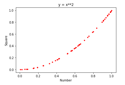
Plot with labels of x and y and title
plt.plot(x, y, 'r.')plt.xlabel('Number')
plt.ylabel('Square')
plt.title('y = x**2')
Plot two or more using subplot
plt.subplot(1,2,1)plt.plot(x,y,'r,')
plt.subplot(1,2,2)
plt.plot(y,x,'b,')
Plot using 'figure'
fig = plt.figure()a = fig.add_axes([0,0,1,1])
a.plot(x,y,'r.')
a.set_xlabel('X Label')
a.set_ylabel('Y Label')
a.set_title('Title')
Plot second inside first using 'figure'
fig = plt.figure()axes1 = fig.add_axes([0,0,1,1])
axes2 = fig.add_axes([0.1,0.6,0.4,0.3])
axes1.plot(x,y)
axes1.set_title('Larger Plot')
axes2.plot(x,y**2)
axes2.set_title('Smaller Plot')
Plot side by side
fig, axes = plt.subplots(nrows=1,ncols=2)axes[0].plot(x,y)
axes[0].set_title('Title 1')
axes[1].plot(y,x)
axes[1].set_title('Title 2')
plt.tight_layout()
Set custom size of chart
fig = plt.figure(figsize=(8,2))ax = fig.add_axes([0,0,1,1])
ax.plot(x,y)
Multiple charts with custom sizes
fig, ax = plt.subplots(nrows=2,ncols=1,figsize=(8,4))ax[0].plot(x,y)
ax[1].plot(x,y**2)
plt.tight_layout()
Save chart in image file
fig.savefig('my_picture.png', dpi=300)
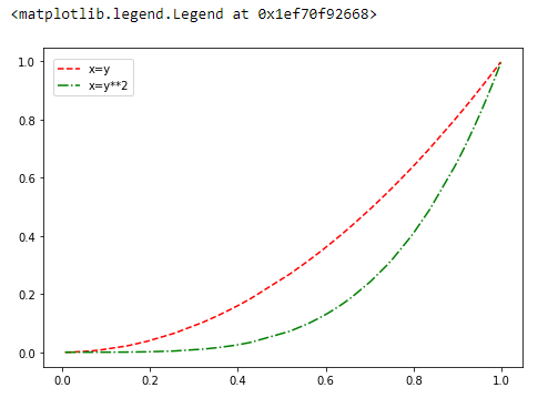
Two lines in one chart
fig = plt.figure()ax = fig.add_axes([0,0,1,1])
ax.plot(x, y, 'r--',label="x=y")
ax.plot(x, y**2, 'g-.', label="x=y**2")
ax.legend(loc=(0.02,0.85))
A part of the chart
fig = plt.figure()ax = fig.add_axes([0,0,1,1])
ax.plot(x,y,color="purple", linewidth=3, alpha=0.5, linestyle='steps', marker="s", markersize=20, markerfacecolor="yellow", markeredgewidth=3, markeredgecolor="green")
ax.set_xlim([0.3,0.7])
ax.set_ylim([0.3,0.7])
Scattered Chart
plt.scatter(x,y)Histogram Chart
plt.hist(x)Box Chart
plt.boxplot([x,y],vert=True, patch_artist=True)SEABORN
import seaborn as snsCreate Dataset using sample provided by Seaborn
tips = sns.load_dataset('tips')tips.head()

View structure of Dataset
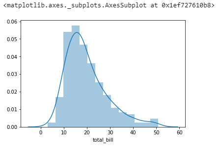
tips.info()Dist Plot without KDE
sns.distplot(tips['total_bill'], kde=False, bins=30)
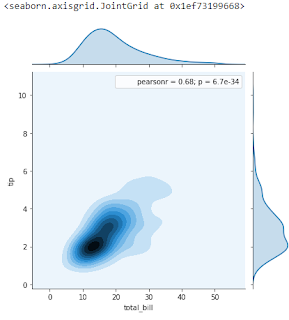
Joint Plot
sns.jointplot(x='total_bill',y='tip',data=tips)Joint Plot Hexagonal
sns.jointplot(x='total_bill',y='tip',data=tips,kind='hex')
Joint Plot Regression
sns.jointplot(x='total_bill',y='tip',data=tips,kind='reg')Joint Plot KDE
sns.jointplot(x='total_bill',y='tip',data=tips,kind='kde')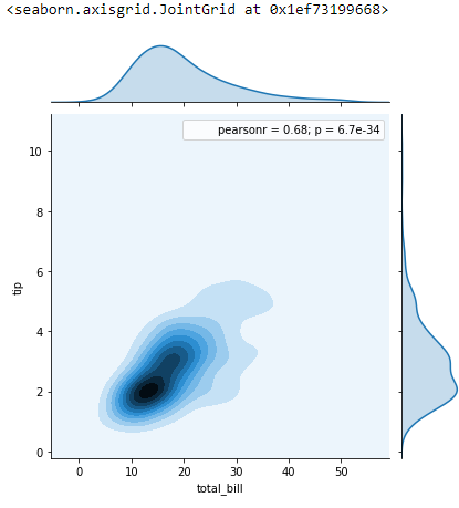
Pair Plot
sns.pairplot(tips)Pair Plot with hue
sns.pairplot(tips, hue='sex', palette='cool')Rug Plot
sns.rugplot(tips['total_bill'])Dist Plot
sns.distplot(tips['total_bill'])Create new Dataset
from scipy import statsdataset = np.random.randn(1000)
sns.rugplot(dataset)
Setup for calculating KDE
x_min = dataset.min() - 2x_max = dataset.max() + 2
x_axis = np.linspace(x_min,x_max,100)
bandwidth = ((4*dataset.std()**5)/(3*len(dataset)))**.2
kernel_list = []
for datapoint in dataset:
kernel = stats.norm(datapoint, bandwidth).pdf(x_axis)
kernel_list.append(kernel)
kernel = kernel/kernel.max()
kernel = kernel*0.4
plt.plot(x_axis, kernel, color="grey", alpha=0.5)
plt.ylim(0,1)
Calculating KDE
sum_of_kde = np.sum(kernel_list, axis=0)fig = plt.plot(x_axis, sum_of_kde, color="indianred")
sns.rugplot(dataset, c="indianred")
plt.yticks([])
plt.suptitle("Sum of the Basis Functions")
Dist Plot
sns.distplot(dataset)Bar Plot
sns.barplot(x='sex', y='total_bill', data=tips, estimator=np.std)Count Plot
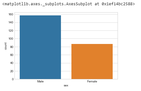
sns.countplot(x='sex', data=tips)Box Plot
sns.boxplot(x='day', y='total_bill', data=tips)Box Plot with hue
sns.boxplot(x='day', y='total_bill', data=tips, hue='smoker')Violin Plot
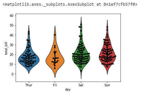
sns.violinplot(x='day', y='total_bill', data=tips)Violin Plot with hue and Split
sns.violinplot(x='day', y='total_bill', data=tips, hue='sex', split=True)Strip Plot
sns.stripplot(x='day', y='total_bill', data=tips, jitter=True, hue='sex', split=True)Swarm Plot
sns.swarmplot(x='day', y='total_bill', data=tips)Violing Plot with Swarm Plot
sns.violinplot(x='day', y='total_bill', data=tips)sns.swarmplot(x='day', y='total_bill', data=tips, color='black')
Factor Plot - Bar
sns.factorplot(x='day', y='total_bill', data=tips, kind='bar')Factor Plot - Violin
sns.factorplot(x='day', y='total_bill', data=tips, kind='violin')Use 'flights' sample dataset provided by Seaborn
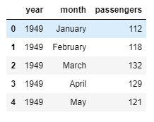
flights = sns.load_dataset('flights')View tips dataset
tips.head()View flights dataset
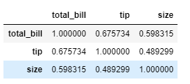
flights.head()Create Correlation of 'tips' dataset
tc = tips.corr()tc
Heat Map
sns.heatmap(tc, annot=True, cmap='coolwarm')Create Pivot Table of 'flights' dataset
fp = flights.pivot_table(index='month', columns='year', values='passengers')fp
Heat Map with line arguments
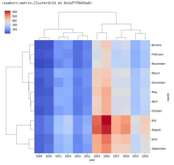
sns.heatmap(fp, cmap='magma', linecolor='white', linewidth=0.1)Cluster Map
sns.clustermap(fp, cmap='coolwarm')Cluster Map with Standard Scale
sns.clustermap(fp, cmap='coolwarm', standard_scale=1)Load New Sample Dataset named 'iris'
iris = sns.load_dataset('iris')
iris.head()
Get unique list of species from iris dataset
iris['species'].unique()
Pair Plot Iris
sns.pairplot(iris)
Pair Grid Iris
g = sns.PairGrid(iris)
g.map(plt.scatter)
Pair Grid with Upper and Lower
g = sns.PairGrid(iris)
g.map_diag(sns.distplot)
g.map_upper(plt.scatter)
g.map_lower(sns.kdeplot)
FacetGrid - Dist Plot
g = sns.FacetGrid(data=tips, col='time', row='smoker')
g.map(sns.distplot, 'total_bill')
FacetGrid - Scatter Plot
g = sns.FacetGrid(data=tips, col='time', row='smoker')
g.map(plt.scatter, 'total_bill', 'tip')
Seaborn LM Plot
sns.lmplot(x='total_bill', y='tip', data=tips)
Seaborn LM Plot with hue
sns.lmplot(x='total_bill', y='tip', data=tips, hue='sex')
Seaborn LM Plot with markers and sizing the markers
sns.lmplot(x='total_bill', y='tip', data=tips, hue='sex', markers=['o','v'], scatter_kws={'s':100})
Seaborn LM Plot with Column
sns.lmplot(x='total_bill', y='tip', data=tips, col='sex')
Seaborn LM Plot with Column and Rows
sns.lmplot(x='total_bill', y='tip', data=tips, col='sex', row='time')
Seaborn LM Plot with Column, Row, and Hue
sns.lmplot(x='total_bill', y='tip', data=tips, col='day', row='time', hue='sex')
]
Seaborn LM Plot with Column and Hue
sns.lmplot(x='total_bill', y='tip', data=tips, col='day', hue='sex')
Seaborn LM Plot with Aspect and Size
sns.lmplot(x='total_bill', y='tip', data=tips, col='day', hue='sex', aspect=0.6, size=8)
Seaborn - Set Style
sns.set_style('whitegrid')
sns.countplot(x='sex', data=tips)
Seaborn Despine
sns.countplot(x='sex', data=tips)
sns.despine(left=True, bottom=True)
Seaborn Context
sns.set_context('poster')
sns.countplot(x='sex', data=tips)
Seaborn - Context with Font Scale
sns.set_context('notebook', font_scale=2)
sns.countplot(x='sex', data=tips)
Seaborn - Palette
sns.lmplot(x='total_bill', y='tip', data=tips, hue='sex', palette='magma')
Comments
Post a Comment